Deadline day!
Posted: May 6, 2016 Filed under: ADZ6888 Field 3 Exhibition - YR15, Field Leave a commentI have just completed my exhibition space, along with he back up work and I couldn’t be more happy and proud of myself!
I added a few finishing touches such as fully wrapped magazine files..


To begin with, my magazine files were only wrapped with my design on the spine, this was because they were all originally touching side by side on the top shelf meaning the fronts and sides were completely covered! However, since rearranging my space all sides of the files will be seen form different angles meaning every side needed to be wrapped, which is what I have spend some of my day doing! My designs have come to life on real products and I am so glad I made the decision to wrap the whole file!
A3 CAD visuals mounted on Foam Board…
I previously had A4 CADS within my space which resulted in a lot of empty white space and I wasn’t using the space to the best of my ability, which is my reasoning for changing my CADS to A3! As well as this my CADS were in glass clip frames which didn’t give the professional feel ans didn’t show off my work to it’s full potential. I them opted to mount them onto foam board meaning that they are not flat against the all but raised and clear to view!
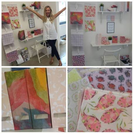
Above is a montage of images displaying my final space, products and samples! As you can see from my face, I am so happy with exhibition space, I have worked so hard to get to this moment and I am truly satisfied with amount of effort, thought and time I have put into it all!
Brand new gift bag!
Posted: May 5, 2016 Filed under: field additional work Leave a commentIt was advised that I made my gift bag much more professional by making it in a better quality card, which I have listened to and followed through. This advise had really brought my collection alive, addition such a professional standard tying in with the rest of my products perfectly! However, I have completely changed the design!
I made this decision throughout the process of designing new gift wrap roll. I began to experiment with other colours within my colour palette and drawings from my sketchbook and the new designs excited me! These designs coordinated with my gift card, gift wrap sheet and roll but adds a new dimension, still playing to my strengths of handcraft and drawing skills which has been the main focus within this project and sums me up as a designer. In addition I kept the size and friendship knot fastening the same as my previous gift bag as these aspects were suitable to this collection and needed no changes.


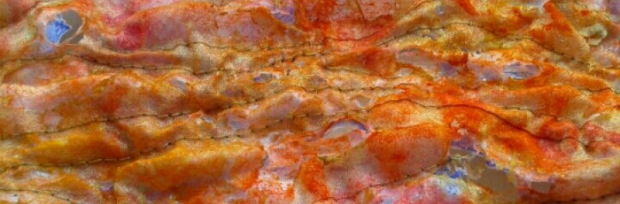
The blue, white and orange combination came from my original photographs I took at Hailing Island of the contrasting wood and rusting metal!
Overall I believe my decision to change the design was the right one, taking my greetings collection to the next level! The professional card displays my work to a high standard fitting my target market well and is in the running to compete with my market competitors.
Self-reflective Journal Report.
Posted: May 5, 2016 Filed under: ADZ6888 Field 3 Exhibition - YR15, Field Leave a commentMy work in general is inspired by themes that attract me through life experiences which I am intrigued to explore further. I tend to begin my design process with hand skills such as drawing, screen printing and weave playing on my strengths. I later on combine them with digital skills to produce transferable surface patterns with an underlying message intertwined within them.
My love for hand craft has been heavily influenced and reinforced through our trip to Morocco which massively helped shape me as a designer. Being surrounded by workmen and women handcrafting ornaments, garments and jewellery really showed the beauty in creating something from an individual talent and skill. This is my reasoning for using my drawing talent as the back bone to my collection.
This particular collection is inspired by the amazing experience that kicked off my first year studying Textiles. Here we were able to privately view the Botanical Archives at The National Museum Wales. I felt as if my work using Botanical Illustration as a theme was short lived and needed revisiting as I hadn’t explored half of the pathways this incredible theme has to offer. I felt this was a great opportunity to explore those pathways which really excited me. I have decided to end my degree how I began it.
I began my research process by arranging another visit to The National Museum Wales where I came across some amazing Botanical illustrators such as Pierre-Joseph Redoute, known for his watercolours of roses and lilies. The precision applied to colour and scientific analysis of plants is absolutely fascinating! I adored the work I saw by Redoute in particular to the vibrant colours he used within his work and the life like quality he was able to portray!
I have decided to design for the Stationery Market. So far I have designed for the interior and paper based greetings market, although I wanted to design for a similar market I wanted to keep the excitement of designing for something which I hadn’t yet had the chance to! The Fashion market is an area which I haven’t had experience designing for at all so I automatically ruled this out which led me to the choice of Stationery which was the most appropriate choice and the best decision to suit me.
Throughout research I found that many products on the market with a botanical theme only covered the floral aspects, disregarding the fruit and vegetable side. I found this through researching a range of stationery companies and retailers such as Paperchase, Wilko, Laura Ashley and Marks and Spencer. Throughout my own research, photography and sketchbook work I naturally swayed towards the fruit aspect as there was a huge gap for it within the market. This then evolved in concentrating on brightly coloured, less typical tropical fruits such as dragon fruits, passion fruits and pomegranates which I enjoyed to draw. Within my brief I specified that I was designing for Spring/Summer, the natural colourings of these fruits suit the seasons perfectly and built up the basic foundation of my colour palette.
This theme has pushed me to experiment, develop and evolve within drawing as I have always tended to stay within my comfort zone of tonal drawings. Drawing in colour has always been a weakness of mine however through watching tutorials, reading online posts and experimenting with techniques I have progressed massively using coloured Medias and widened my skillset! Although it is important to work to your strengths I also believe it to be important to carry on growing and emerging as a designer strengthening your weaknesses.
I have also worked on my Photoshop skills which were not an aspect I saw as a strength previous to this project but an aspect I found vital to my designing process, so something I knew I needed to work on and improve. I attended a Photoshop session provided by the university as well as that I taught myself the techniques through constant experimentation, persistence and learning through my mistakes, ensuring that hand processes were not over digitalised. Throughout this digital design process I found a strength of mine to be colour coordination and composition.
Throughout the 3 years of studying Textiles I have been around many females of different ages, leading to my target market of females aged 15-25 years. Others and I have experienced lack of self-confidence within their appearance or lack of motivation within education. As I had already decided I was designing stationery used within education I thought it would be a great idea to include messages of self-love and empowerment and motivational within education. Making a small contribution towards tackling the self-loath many young women suffer from is something which fills me with motivation. I have so many inspiring and motivation quotes pinned to my wall, on my phone and scribbled across work books which really keep me going when I feel I have hit a low point, justifying why I added a combination of quotes by Buddha to my designs, altering and changing them to give the right message. This adds an innovative aspect and underlying message within my collection. In addition, my dissertation was based upon female portrayal and empowerment which has linked perfectly to Field.
I decided to base most of my technical work within the print studio rather than the stitch studio as I have found myself and grow as a designer through print rather than stitch and embroidery. My strength out of the two would be print! However, I did venture into stitch when it came to sewing my pencil cases, overlocking my final samples and sewing my headers. I gained a lot more confidence within myself within this area of Textiles. If this project was extended I would most definitely spend a great amount of time strengthening my stitch skills and lightly embellishing my samples with an array of stitches and knotting techniques which I have briefly touched on within the course as a whole. One of my market competitors, Accessorize, adds these finishing touches and it really does make some products so special!
As a course member I believe a strength of mine has been the contribution of my time and ideas within fund raising for our Final Major Project. I have built on many skills such as organisational, time management and team work skills and self-confidence as a designer which are all qualities I can take with me to the work place.
Overall, I have understood and accepted my weaknesses which I have acted upon and tried to improve where I could. I have noticed my strengths as a designer and used them to the best of my ability which I have displayed within my collection, back up work and exhibition.
Press packs!
Posted: May 5, 2016 Filed under: ADZ6888 Field 3 Exhibition - YR15, Field Leave a commentWhat is it?
A press pack is a marketing tool composed of an information pack about your business/product/what you do that is designed to be forwarded to an organisation (media outlet stores or art gallery).
…A press pack is an invaluable resource to take your vision to the world…
Why a Press Pack
To:
set yourself apart from the rest of the competition,
gain publicity/exposure,
introduce yourself to an agency, company, gallery
or a targeted individual.
The aim of a press pack is to effectively answer the five ‘W’s:
1. Who are you?
2. What are you promoting?
3. When is it happening?
4. Why are you approaching them/what are you seeking?
5. Where can they find you/it?
A press pack is like a creative extended résumé that can include a:
Folder
Letter of interest
Copies of articles and press releases if you have them
A CV / résumé, (a must)
Business card, (a must)
A CD of images
A standard-sized color print-out of what you’re promoting (optional)
A postcard (optional but nice)
Within my press pack I have included a CV. I made the decision to print my CV back to back on a glossy thin card rather than folding a piece in half to fit inside the folder. This id something I created on Photoshop. I took time to design a creative CV displaying images from my collection to keep a fresh image of my collection in mind for the person who picked up my press pack and remind them why they chose to take one and the qualities of my work they enjoyed!


Next, I have included a Cover letter which is less direct to a certain company. I have kept the same background purple box surrounding the title of the page to keep in uniform. I had a small amount of room to apply my signature so I decided to incorporate it within the back ground design which I am so pleased about and adds a new dimension, keeping a creative concept.
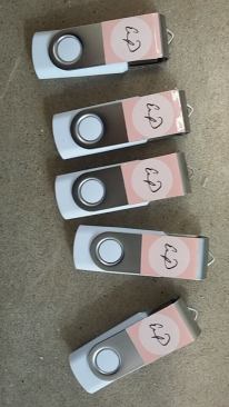
Rather than putting my designs ect .. onto a CD I chose to put it all onto a USB stick. My reasoning for this is due to many new laptops not containing a CD drive, including my own. USB’s are much more current compared to CD’s which are becoming something of the past. I personalised the outer of my memory sticks with my logo, which tye in with the headers of my samples!
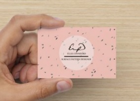
Business card: I chose to keep the background of my business card as well as my CV simple ensuring the main information was not over powered. The limited use of colour within my buisness card is sleek, professional and cleverly thought through!
As an added extra I have included a sticker with my design on. When the person sticks sees my sticker which they stuck on an item they will always think of me and my collection. My collection will keep popping up, and you never know it may pop in just when they need a designer like me, giving job opportunities!
Today I put my press packs together, I am so pleased with the outcome and professional standard I have been able to maintain. I believe the information and images I have included are appropriate and represent me as a designer, showing my work off in the best light!
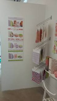
Dressing my exhibition space.
Posted: May 5, 2016 Filed under: ADZ6888 Field 3 Exhibition - YR15, Field Leave a commentMy idea was to create a desk space and applying my products within it, creating stationery products natural place, setting the scene for the viewer!
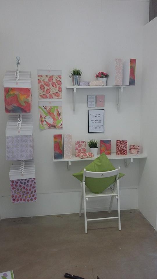
My idea was to create a desk space – I chose to place a shelf in my space rather than an actual desk as I wanted a delicate pretty area rather then a overloaded bulky space. I planned to displays my products which I have made, and ordered. As well as this I wanted to place another shelf in my space with mock up of products tying in colours and co ordinating prints, showing off my work to its full potential. I also knew I wanted to included a frame with the quote which features within my designs as it’s an important aspect o my designs an the message of self love and empowerment to young females.
To gain a better idea of how to lay my space out I searched ‘desk space’ on search engines such as Pinterest, Google and Flcikr ( shown within my research file). This really helped me with layouts but mostly with props to include, such as desk lamps, posters, mugs and photo frames. From here I drew up multiple mock ups including everything I wanted to as well as everything which is required..
I began the process of painting and dressing my space at the beginning of buddy week and I couldn’t be more relieved with the decision I made. I found when you begin to dress your space so many new innovative ideas appear in your mind, new layouts, new props, changing shelf heights ect.. the list is endless! As you can tell the layout of my space has gradually changed throughout this period of time, from the images below. It is a huge aim for me to create a space which I am proud of and a space I feel represents me as a designer.


Today we were given 2 fresh pairs of eyes to look over our spaces and suggest slight adjustments to consider. This process was so useful and reinforced the importance of layout. I saw how the slight adjustment to CAD size and product placement for example took the overall appearance of work from good to fantastic! I spent most of the day creating these adjustments, with only a few tweeks to make in the morning for deadline day ..
My space currently..
Posted: May 3, 2016 Filed under: ADZ6888 Field 3 Exhibition - YR15, Field, Uncategorized Leave a comment
I have decided to display my designs in CAD Visuals for swimwear to give an alternative..
I have chosen this market as my tropical theme and target market of females ages 15-25 years suits the summer holidays! Tropical fruit also grow in hot climates and display an array of bright, summery colours perfect for my designs to be worn at the beach!


Gift wrap roll – Experimentation and Development.
Posted: May 3, 2016 Filed under: field additional work Leave a commentMy feedback included a comment which explained that the motifs within my original gift wrap roll were far too sparse, meaning that when a gift was wrapped you didn’t get the full effect of the pattern. It was suggested to me that I re designed my gift wrap roll and brought the motifs closer together, which I have completed (Within the black box clearly labeled within my studio space).
Before and after:


")
As well as this I decided to create a book of new designs displaying a variety of motifs and compositions such as borders, stripes and scattered. I also experimented with scale of motifs which gave a completely different design.


I also experimented with other colours within my colour pallet as we all alternative continuous line drawings which I now understand are a strength of mine.


I used various photo shop appliances to create these new designs. The white and blue contrast screams ‘BEACH’ to me and links to my theme perfectly. A deeper insight into the design processes are shown within the black book inside of the labelled black box within my studio space.
Reusable greetings card.
Posted: May 3, 2016 Filed under: field additional work Leave a commentThere are multiple ways in which my greetings card can be reused to suit both males and females.
Shown in the diagram below:
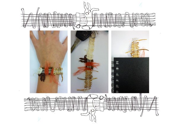
- Fashion accessory – Bracelet
- Key ring
- Bookmark
I would have this diagram printed onto the back of the greetings card to make the purchaser/receiver aware of it’s multipurpose quality.
I believe this unique selling point is a factor which differentiates my product from the other greetings cards within the market. I believe my unique selling point has a clear unique benefit to consumers and offers the customer and receiver of the greetings card something that competitive products do not currently offer and will evoke interest, attracting more customers.
I have come up with 3 ways in which the greetings card can be used, ensuring both women and men have at least one option. As well as this the range of different uses targets different age ranges ensuring that my product suits a large pool of people.
This USP solves a customer problem and satisfies customers needs.
Presenting my Alternate Colour Palette samples.
Posted: May 3, 2016 Filed under: ADZ6888 Field 3 Exhibition - YR15, Field Leave a comment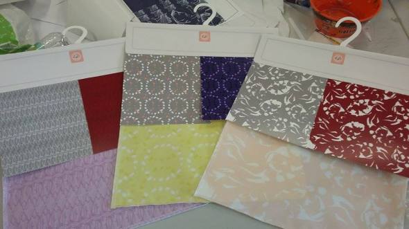
The notebooks I will display within my studio space are made from a glossy card. Many stationery products such as magazine files and storage boxes come in a paperbased material which proved importance to be represented within my samples. I took the opportunity to incorporate paper-based samples to show my alternate colour palette.
I outsourced these paper-based samples as I have continuously used the services within university and have been disappointed with the colour, loosing a lot of money through doing so, paying that bit extra with a guaranteed quality was so worth it to me!
I chose to include 1 alternative colour pallet sample within each family with an alternative colour way sample within the alternative colour pallet to show diversity, range and possibility within my collection. I have displayed these samples at a smaller scale to ensure the original design was not hidden and it’s limelight was not stolen!
CAD Visulas
Posted: May 1, 2016 Filed under: ADZ6888 Field 3 Exhibition - YR15, Field Leave a comment


Recent Comments